
The Guide to Duxbury Mobile App
The Guide to Duxbury app gives residents access to key features and town services to help them stay informed, connected, and engaged with their community.

Description
Goals
Municipal websites are often difficult to navigate, making it challenging for residents to quickly access the services and information they need. The Duxbury app reimagines this experience by serving as a mobile companion to the town’s website. Designed with simplicity and accessibility in mind, the app presents essential resources, including service requests, local updates, and town contacts. With a clear and intuitive interface, its modern design reduces clutter and provides a more user-friendly alternative for residents on the go.
Simplify access to essential town services and resources.
Create a clean, visually appealing design that improves usability compared to traditional municipal websites.
Keep residents informed and engaged with timely updates and notifications.
Strengthen community connection by offering a central, mobile-friendly hub for local information.
Process
Information & Architecture
To begin the design of the app, I first created a sitemap of the current Duxbury municipal site to get a base understanding of everything included on it. During this process, the site’s information architecture (IA) was assessed and analyzed to find inefficiencies and opportunities for improvement. I then redesigned the site's information architecture, focusing on the needs of resident users.
Current Website IA Sitemap

New Website IA Sitemap Proposal
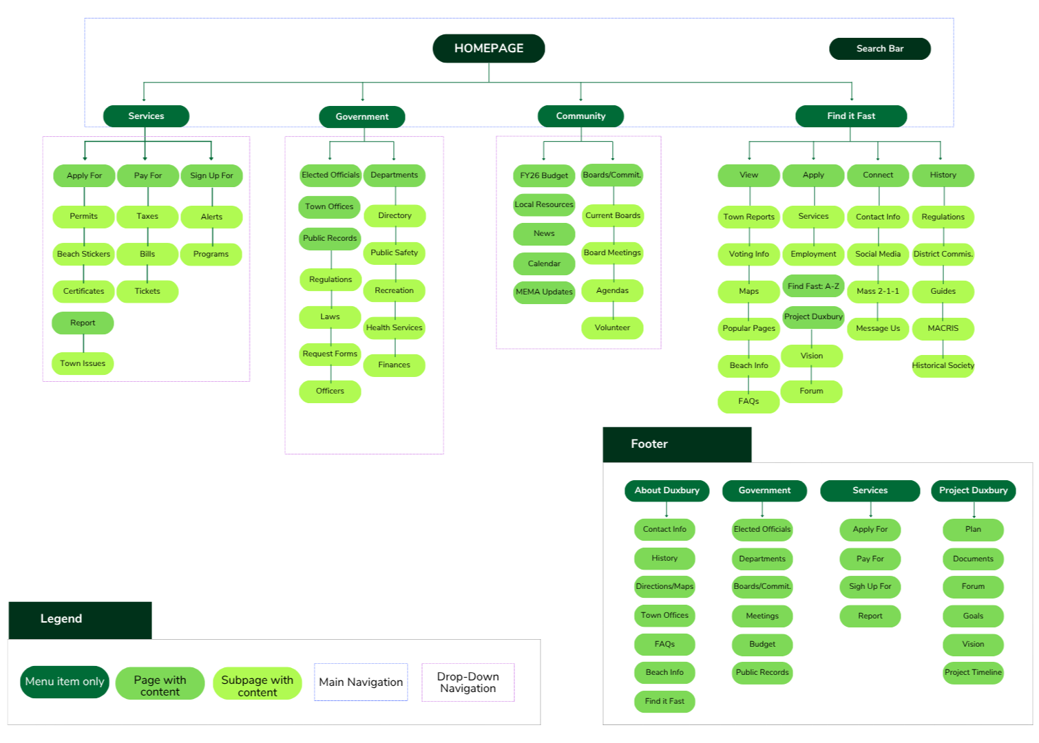
Companion App Sitemap

User Research
Target Audience
The target audience of the Guide to Duxbury app consists of new and long-time Duxbury residents who rely on their mobile devices for town updates and alerts, and up-to-date information on events, government, and the community. Residents who will use the app, especially those who are familiar with the Duxbury site, will benefit from a more convenient way of accessing information and resources.
Personas
After creating a site map and defining user needs, 3 personas were identified for further app development.

Jim
Age: 39
Education: MBA
Occupation: Business Manager
Residency: Moved to Duxbury 12 years ago after getting married.
“As a working parent, I want to pay my property taxes quickly through the app so I don’t have to worry about missing deadlines.”

Rachel
Age: 27
Education: Bachelor’s Degree
Occupation: Therapist
Residency: Recently married, just moved to Duxbury. Looking to get involved and get settled.
“As a new resident, I want to apply for a beach parking sticker easily so I can enjoy the summer without hassle.”
User Needs
Mobile-friendly bill payment options
Easy permit and license applications
Event and meeting information on-the-go
Centralized access to up-to-date resources
Personalized notifications

Jen
Age: 34
Education: High School
Occupation: Entrepreneur
Residency: Has lived in Duxbury ever since starting her business 10 years ago.
“As a business owner, I want to stay informed about town meetings and public notices so I can stay ahead of local policy changes.”
User Flows
After generating the 3 personas, 3 user scenarios were developed from each persona and showcased through user flows. The user flow stories involve some of the more complicated yet common tasks users might face on the resident app.
Flowchart #1

Prototyping Phase
Low Fidelity Prototyping
I began the UI design process with low-fidelity paper prototypes, fully mapping out the three scenarios defined in the user flows for this initial round. To make these, I printed out iPhone wireframes and used colored pens to sketch out the screens. For some screens, I cut out pieces of paper and taped them down to represent buttons, menus, or other interactive elements.


High Fidelity Prototyping
After conducting user testing on the paper prototype, I used the feedback to develop a more functional and user-friendly medium-to-high-fidelity version of the app in Figma. Key changes included clarifying navigation, enhancing the events interface, and refining the way users save and access locations.
The updated screens now offer a clearer, more intuitive experience that reflects the needs of the target audience.

Reflections & Next Steps

The Guide to Duxbury app makes it easier for residents and visitors to explore the town’s services and offerings. Through this project, I gained experience taking an app from concept to prototype with a focus on user-centered design.
The next phase of this project would involve conducting another round of usability testing on the high-fidelity prototypes. This phase would move the prototype one step closer to becoming a usable and impactful mobile app for Duxbury residents.